Senedd 2026
Next year is an election year here in Wales. Interestingly, it’s the first election under a new proportional representation system that will see 6 members elected from each one of 16 new constituencies. An interesting time politically for those of us who live in Wales, but also interesting from a Data Visualisation perspective.
Up until now, election maps in Wales have been relatively simple, and not just because you take a map of Wales and colour it mostly red. The country is divided into several distinct areas, each of which elects a member of parliament (or Senedd in our case), which means election maps are just a case of drawing the area boundaries and colouring them according to the winner, as we’ve seen in election map time after time. Of course, the Senedd election has always had an interesting wrinkle in that there has always been an element of proportional representation included, with a First Past the Post system used to elect constituency members, and a proportional system used to elect members from the regional lists in 4 different electoral regions.
Representing the results of proportional representation elections geographically is much trickier than with fptp, as we don’t have a single winner in each geographic area, meaning we can’t just draw the boundaries and colour the area in. I’ve previously played with a couple of different ways to do this - attempting a proportional striping of geographic areas (as proposed by Ondrejka, 2012), or using a fixed shape on top of the geographic area to represent the proportional winners. Neither works particularly well.
However, this attempt also included a hexmap, where 4 hexes are used to represent each of the electoral regions - and this is perhaps a little more successful. Could this be the solution for the 2026 election results? If we’re going to use hexagons to represent the election results, then we need a hexmap of Wales, and the ones I’d created earlier weren’t going to work because the number of boundaries and areas has changed since 2021. There are some nice tools out there to help with creating hexmaps, and a flavour of json for describing them, hexjson, so all that was needed was to work out how to draw wales using the right number of hexagons. Time to break out the colouring pencils!
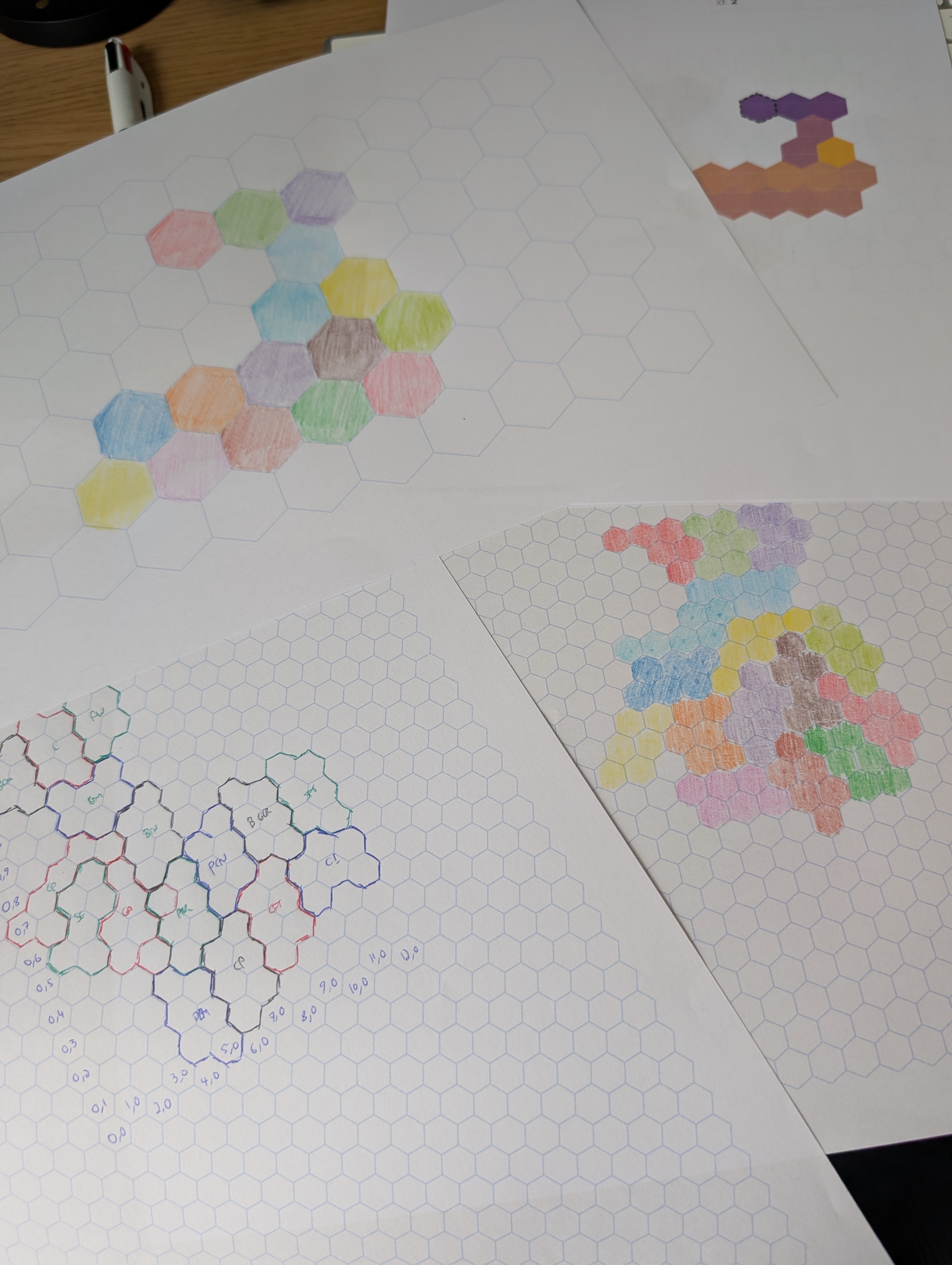
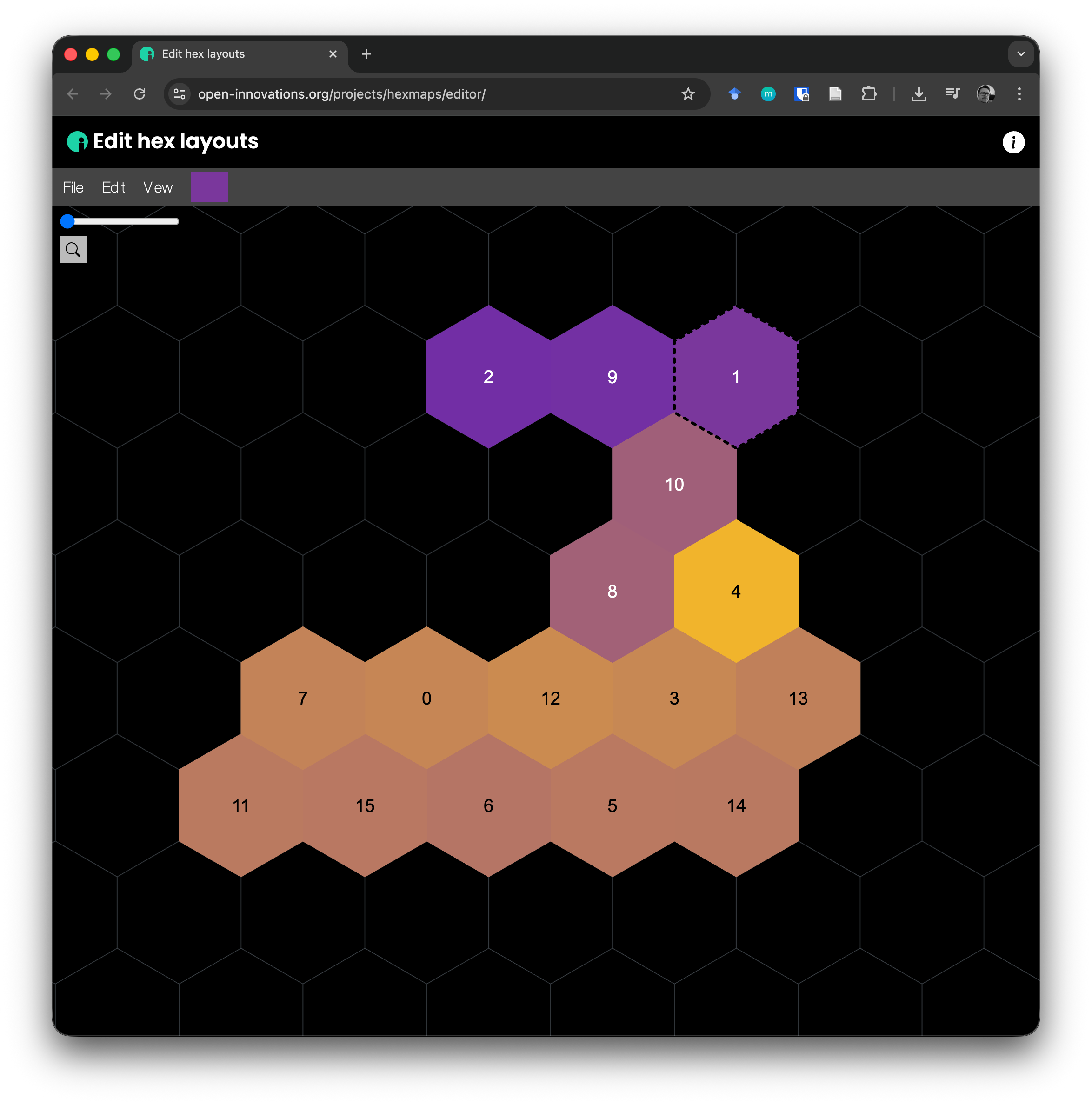
With a little bit of trial and error, I managed to assemble the new constituencies into a reasonable approximation of a hexmap of Wales. All that was left to do now was to turn this into the hexjson format that can describe such maps, and start playing with how to visualise the results. Fortunately the Open Innovations team have lots of useful tools for working with hexmaps, including their hexmap editor which made the process relatively straightforward.
In a future post, I’ll talk about what else we can do for visualising the proportional results for the Senedd elections in 2026.
Next: Simple Strava Downloader in Python
Previous: DataJConf 5.0